Armoire
STARTING WITH THE Basics
ROLE: UX Researcher and Team Lead
CHALLENGE: Design mobile-first wireframes and prototype for (1) a new closet history, (2) the ability to leave clothing reviews at any time, and (3) purchasing previously rented items.
TOOLS: Sketch, InVision, Zoom, UsabilityHub
METHODS: User research interviews, Usability testing, Qualitative coding, Preference Tests via Usabilityhub, Competitive analysis, Market research
TEAMMATES: Zara Anderson, Alexander Yamato, and Olena Khomchenko
CONTEXT: While working with the Head of UX at Armoire on a 3-week design sprint, my team and I overhauled the user’s closet history, purchase, and reviews experience. I specifically led user research, usability testing, and data synthesis to inform design decisions as well as was responsible for all communications with the client.
Armoire is a rental clothing startup based out of Seattle, WA and caters to women 30-60 who are busy, social, and stylish. They strive to give professional women a way to access fashion that is easy, fast, and fun.
KEY FINDING: One of our most interesting findings was that while Armoire really wanted this feature, members did not desire the ability to purchase an item at any time after it was returned. Taking this finding into account, we worked on instead creating a Closet History showcasing the unavailability of items to entice members to purchase while the item is in their possession.
There was a reason the closet history needed an overhaul
In its current state, the closet history was called “RE-WEAR” and was designed for members to re-rent items. Fitting for this design, members were only able to see items that were currently in Armoire’s inventory.
Showing only the items in inventory made a lot of logistical sense for the company, but was a growing frustration for the users. Members wanted the ability to see all of their previously rented items.

EMPTY RE-WEAR STATE
Let me give you a taste of the members’ pain poinT
As you can see here, sometimes a member who has rented over 50 pieces of clothing would go into the “RE-WEAR” tab and not see anything. All those cute blouses and that dress people wouldn’t stop giving her compliments on, were gone. Talk about frustrating!
The Research

I conducted user research and usability testing with 6 Armoire members ranging in age from 30-37
Members came from New York, Seattle, San Diego, Fargo, and Dallas
Their careers ranged from Registered Dietician, UX Designer, Director of Digital Technology, Product Manager, and Sr. UX Designer. They were all very busy women - a perfect representation of the Armoire demographic
These members had been Armoire members for between 1.5 and 6 months. Armoire’s member base was growing drastically and this gave us great insight into how we could improve the new users’ experience
We learned that 5 of 6 members believed their previously rented items would be available to rent Again later
One member explicitly said,
“I would be upset if the item I like is not available later”
This belief was an issue because it was not true. Two thirds of Armoire’s inventory was out of stock at any given time because it was out with another member, had been purchased, or had been retired due to being outworn.
We realized that we needed to focus our designs on providing clarity to these new members so that they could have the right expectations from the beginning. In doing this we thought we could curb frustration and increase retention rates.
Closet History
users wanted to go to their closet history to see preference trends over time
Because a full Closet History didn’t exist, we asked members during user research what they would like to get out of their Closet History. They said things like:
I want to go into the RE-WEAR tab to see clothes I’ve worn before and really liked. Let’s say I want to buy a pair of jeans, I want the ability to go into my RE-WEAR section and see all the past jeans I’ve rented as well as my fit & style notes about each pair. That way I’ll know what fit well and what didn’t, what brands I like the most, and what occasions I could wear them
I want the ability to compare blazers I’ve rented in the past side by side
I don’t want to see everything I’ve rented before, but I do want to see everything I’ve “favorited” before (to favorite something is to mark it with a heart)
I want the ability to sort based on seasons. Like if last summer I wore a really cute top that I got lots of compliments on, I will want to rent it again this summer
I expect to see the RE-WEAR section in chronological order of when I rented each item (i.e. latest rentals at the top)
Combined with our mission to provide more clarity, WE designed the closet history with user feedback in mind
Taking user feedback into account, we designed a new feature that we called the Closet History. It’s primary functionality was to:
Show all of a members’s previously rented items
Display all items in chronological order based upon rental month
Indicate with a greyed-out button state if an item is unavailable to rent
Have both a 1-column and 2-column layout with a toggle to transfer between the two states
Filters to sort by favorited items, available/unavailable items, seasons, user ratings, and type of garment (blazer, skirt, dress, shirt, pants)
We started with sketching on paper…
I drew multiple versions of the Closet History and pitched my designs to my teammates. We each did this exercise and decided upon the primary features to include in our final designs. Here are my sketches:

My Sketches : Closet History Page V1
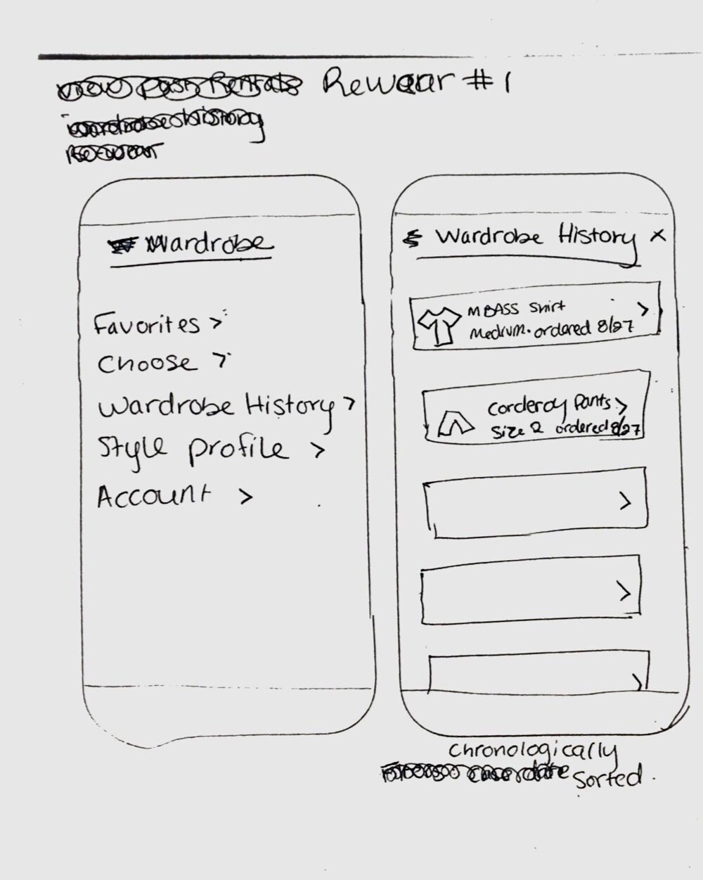
My Sketches: Closet History Page V2
We then moved to digital Sketching
We created multiple versions of digital designs before I assigned teammates Zara and Alexander to take the lead in creating the final versions below.

1 COLUMN LAYOUT

2 COLUMN LAYOUT - ALL AVAILABLE ITEMS

2 COLUMN LAYOUT - DEFAULT STATE WITH AVAILABLE AND UNAVAILABLE ITEMS

FILTERS

DESKTOP LAYOUT
Reviews

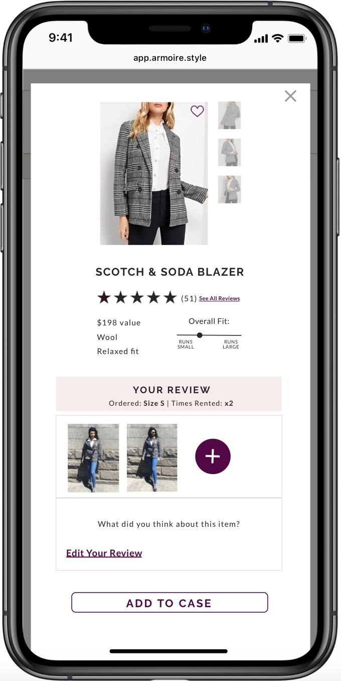
CURRENT REVIEW STATE
Currently members are only able to upload photos and write reviews of products at one time - upon returning them
Restricting the user’s ability to leave reviews to one time was problematic because:
One of Armoire’s goals was to increase member engagement and retention rates. Reviews are a great way for members to engage, and if members are limited to leaving a review only once, there is a lost opportunity
Products with more reviews are rented more often
Users rely on reviews to get an honest assessment of the product
6 out of 6 of our user research participants valued seeing reviews from other members to determine fit, style, and where to wear a garment, however the majority did not leave reviews (4 out of 6). The majority did not leave reviews because: (1) If members were short on time, they would not take the time to write a comment or upload a photo. (2) 3 out of 6 of the participants did not like taking selfies, therefore they did not upload photos of how they styled each garment
We needed to design a way not only for members to leave a review at anytime, but also encourage them to do so

So we looked at how Armoire’s direct competitors encouraged customers to leave reviews
As well as looked at exemplary reviewing systems from across-industry companies like Ulta and Shein.
we designed the closet history to prioritize leaving reviews
This allowed members to leave a review at any time.
The placement of the “Review” button on the Closet History page was intentional. With such a prominent button location, users were called to review their garments.

CLOSET HISTORY
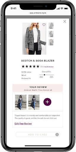
FINAL REVIEW PAGE
We went through a couple Versions to come up with the final Iteration of the review page
In our designs we utilized information hierarchy and visual design to emphasize the actions we wanted our users to take: our primary user goal was to leave a photo review, hence as we iterated, we emphasized the “Add a Photo” icon while designing a cohesive layout that focused on the review.

MY SKETCHES

DIGITAL VERSION 1

DIGITAL VERSION 2
Competitor research INSPIRED US TO ADD A “OVERALL FIT” SLIDER
We researched Armoire competitors like Rent the Runway, Le Tote, and Stitch Fix, but found very interesting features around reviews at J.Crew and Ulta. The crowdsourced descriptions in the photos below were created by user reviews, are deeply informative, and build trust with members. We used the overall fit slider in our designs and recommended that Armoire crowdsource member reviews using Ulta’s method upon gaining a large enough membership base.

BUY NOW

CURRENT BUY NOW SCREEN
We designED a way for members to purchase previously rented items after The Garment had been sent back to Armoire
For Armoire, selling items is a great way to increase revenue. As you can see here, this is currently how members are able to buy items. Members are only able to access this screen when they physically have the items rented out.
WE DESIGNED A BUY NOW FLOW AND I USABILITY TESTED IT WITH ARMOIRE MEMBERS


As I tested this flow with members, I discovered that in fact, no one wanted this feature
6 out of 6 members did not want to have the ability to buy previously rented items from the RE-WEAR page because they loved the renting process of augmenting their wardrobe and thought it was important to physically have the item on hand to determine the fit and quality. Members said things like:
“If you really like it, you should buy it the first time you rent it”
“I would like to know the quality of the item before I buy it”
“I would be upset if the item I like is not available to buy later”
“If I knew I wouldn’t be able to rent it again, I’d be more likely to buy it now”
These comments led us to believe that we should design a solution giving members more visibility into how many items are unavailable at a given time thereby enticing them to buy items while rented. You can see how we did this in the Closet History section above.
We shared this surprising finding with Katrina, the Head of UX at Armoire, and recommended that instead of continuing to design a way for members to purchase at any time after returning the garment, a simple and more cost effective design solution for Armoire would be to provide visibility into the unavailability of items to increase number of items purchased while rented. Ultimately this simpler solution would save Armoire the cost and time of developing an entirely new feature.
In the end…

THE PROTOTYPE
Reviewing our Outcomes
The Buy Now feature got axed due to user research validating that it was not wanted
Reviews were moved to a primary navigation feature
Closet history showed all items and specific filters for season, type of garment, rating, and favorites to allow the functionality that users wanted
And Next Steps
Explore filter usage and preferred default states
Conduct usability tests on each design solution with a larger number of Armoire members