
ROLE: UX Designer and Business Analyst
CHALLENGE: Design a way for Colorado school districts and colleges to track and be reimbursed for education expenses
TOOLS: Sketch, InVision, Loom, Zeplin, Azure DevOps, User Stories, Wave, Axe
METHODS: Stakeholder interviews, comparative analysis, affinity diagraming, paper sketching, hi fidelity wireframing, prototyping
TEAMMATES: 2 UX Designers, 8 Developers, 1 Project Manager, 1 Business Analyst, 1 Scrum Master
CONTEXT: In order to offset the high costs of running career and technical programming, Colorado school districts and institutions apply for federal grant money to help cover their expenses. To do this, they fill out extensive online forms detailing their budget for the upcoming year. Then, at the end of the year, they are required to document their spending. I had designed the budgeting system earlier in the project, and was now tasked with designing how to document their actual spending.
TIMELINE: April - May 2020
ACCOMPLISHMENTS:
Built financial documentation from scratch (there was not a legacy system)
Learned how to work with developers and communicate a successful handoff
Designed a digital signature component that saved users up to 100 hours of manual collection of signatures across the state
KEY LEARNINGS:
Toggles vs Checkboxes - According to the Nielsen Norman Group, while a checkbox and a toggle switch are similar, a toggle switch is meant to take effect immediately while a single checkbox takes effect only once the changes have been saved
I learned to put a lot of time into creating consistent and explanatory titles because consistent copy can help make a complex system less complex (this is an easy win leading to less user frustration!)
Designing from scratch without a legacy model to work with is incredibly rewarding and challenging
As a Business Analyst, make sure to pressure test backend equations by using test scenarios and review them with the client several times before the Devs begin their work
When dealing with math, it is best to have a mathematician on the team
FUTURE IMPROVEMENTS:
I would not use side navigation, I would use header level navigation in addition to breadcrumbs on each page
Process
RESEARCH:
I used sticky notes on my wall to understand the complex layers of the legacy system
I used other financial tracking software as inspiration
I spent over 70 hours interviewing the client and end users plus more than 40 hours watching recordings
I facilitated usability tests on the legacy site for key users


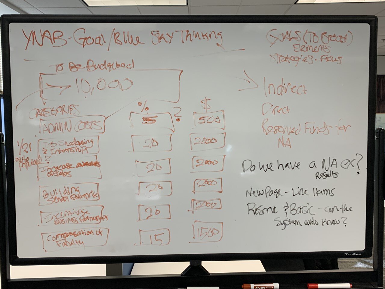
WHITEBOARDING:


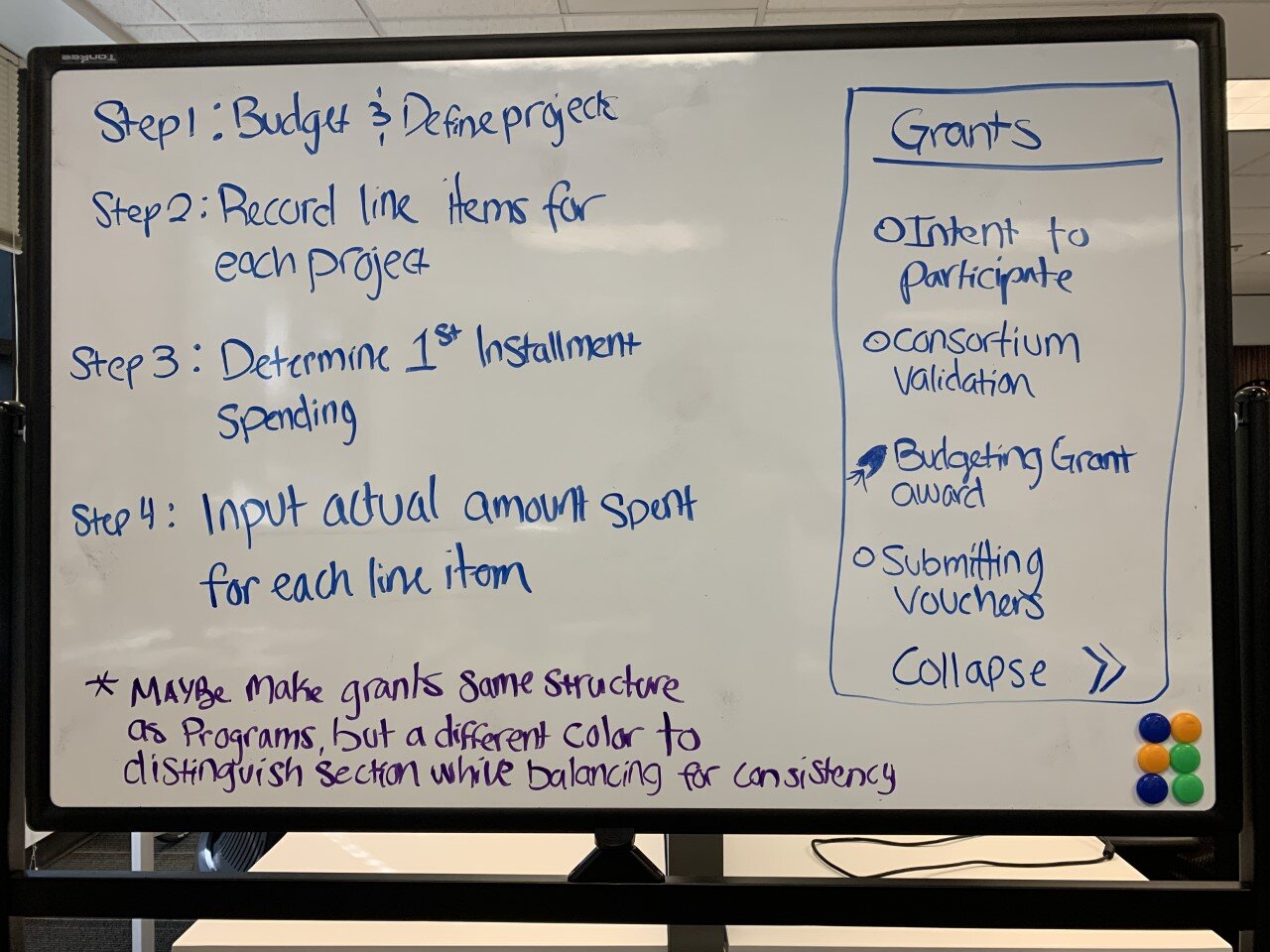

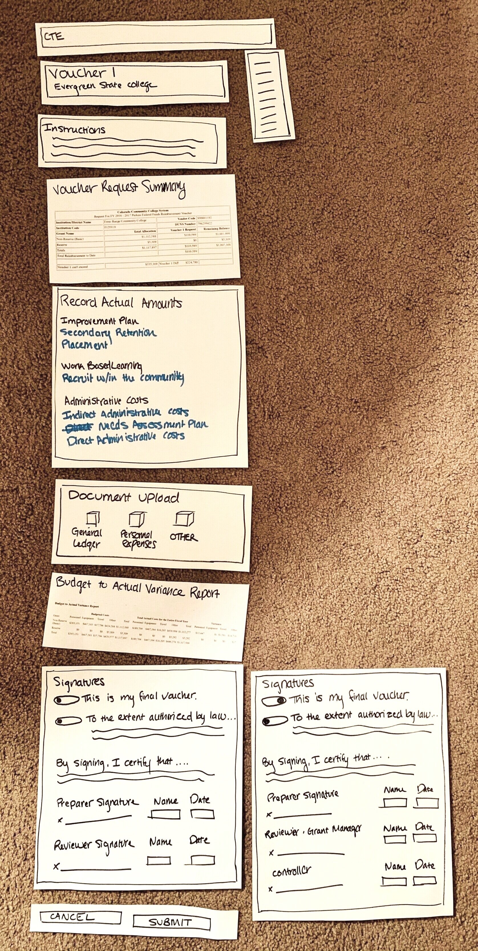
PAPER SKETCHING:

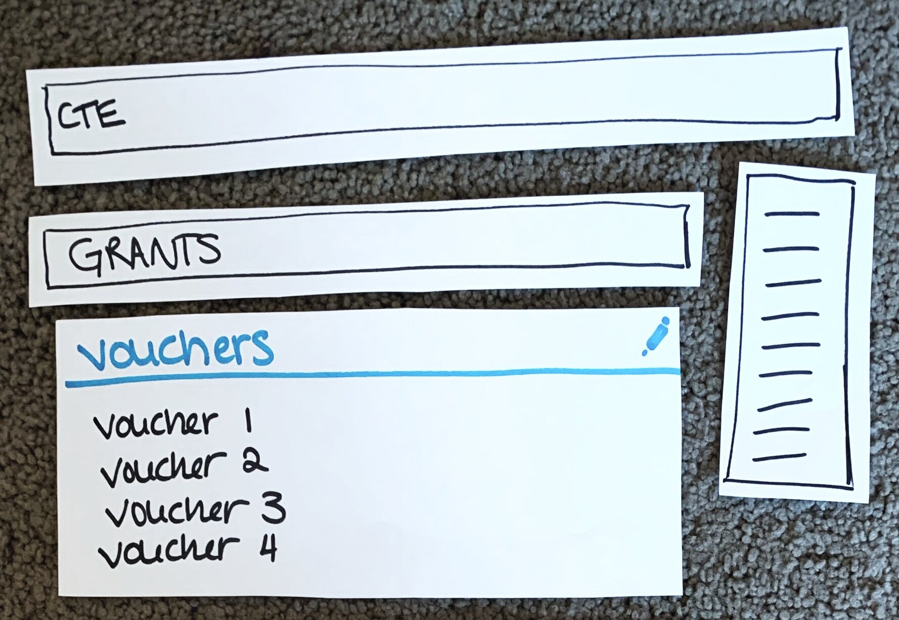


Lo-Fidelity Paper Wireframe
VOUCHER EXPENSE TRACKING: 1st Page
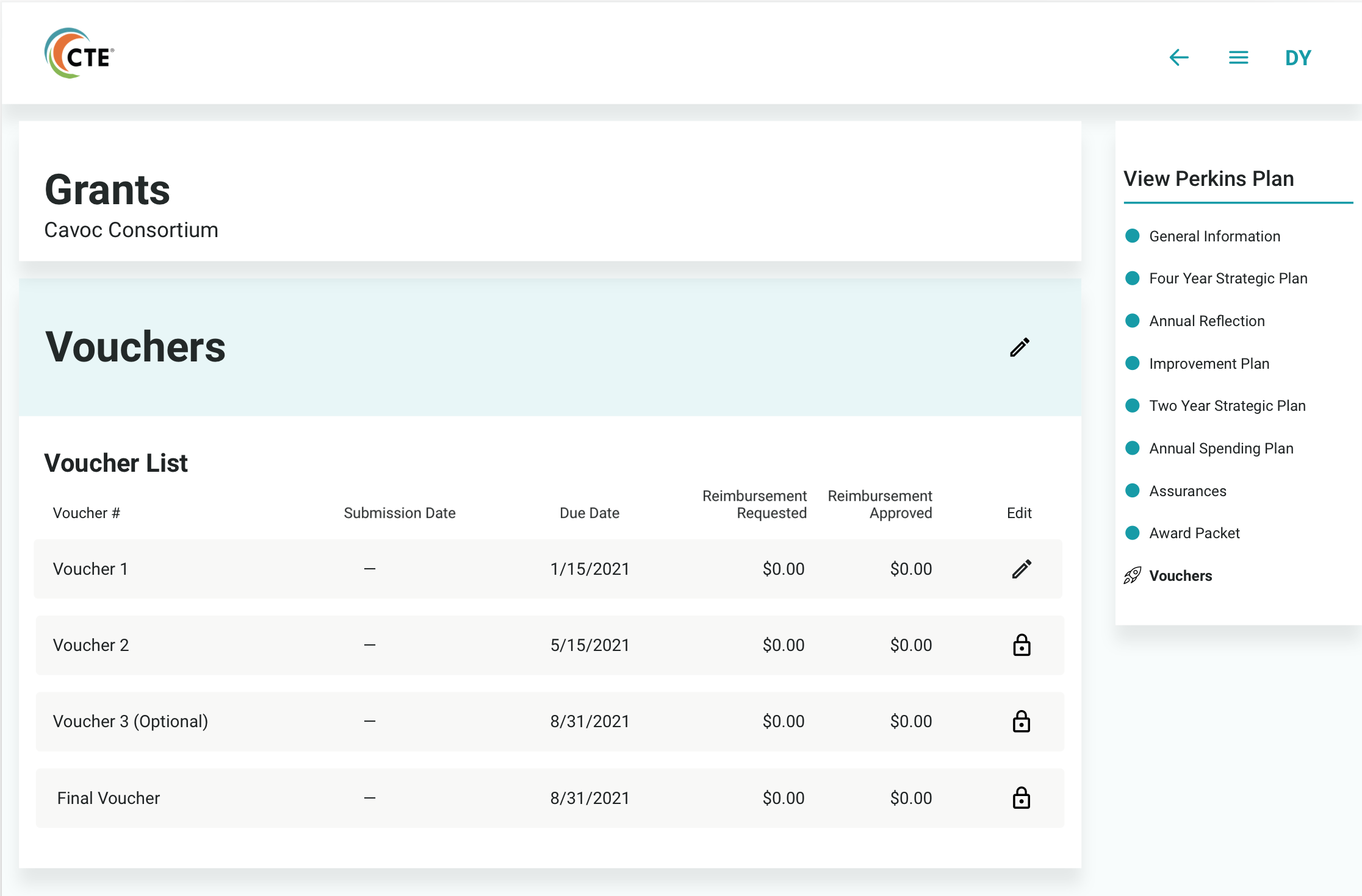
Hi-Fidelity Wireframe of the Voucher List Component
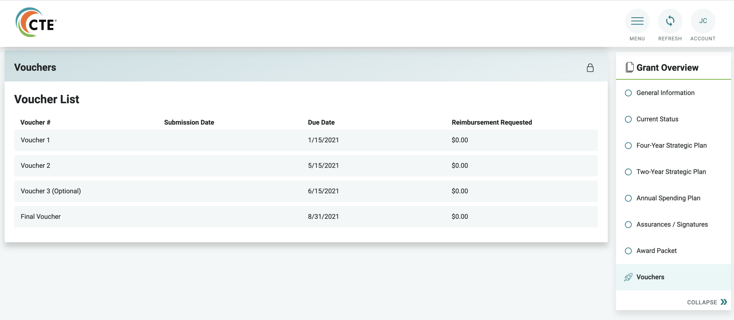
How the Developers built the Voucher List Component
VOUCHER EXPENSE TRACKING: 2nd Page

Hi-Fidelity Wireframe
The second page of Vouchers is a main navigational page for the user. On this page, they need high level monetary information as well as the ability to access each “project” to record expenses.
This is also the page in which users upload pertinent general ledgers and receipts, as well as sign a legally binding contract.
VOUCHER EXPENSE TRACKING: 3rd Page

Hi Fidelity: Expense List Component

Hi Fidelity: Expense List Component with Equipment Expense Drawer